


Q&A:
1. What strengths and weaknesses do you see in your own work?
A. I believe one of the strengths in my work is the ability to capture what I see every day. I take photos of what I see everyday, but able to transform it to highlight some of the elements of art. One of the weaknesses may be the inconsistent camera quality. It’s definitely something I want to work on.
2. How might you improve or refine your approach in future photography projects?
A. I’m thinking of refining my approach in terms of the different angles I take my photos in. As of now I’ve been capturing the superficial layers of certain objects. I want to work on capturing more so, the little details, things that people don’t tend to concentrate on.
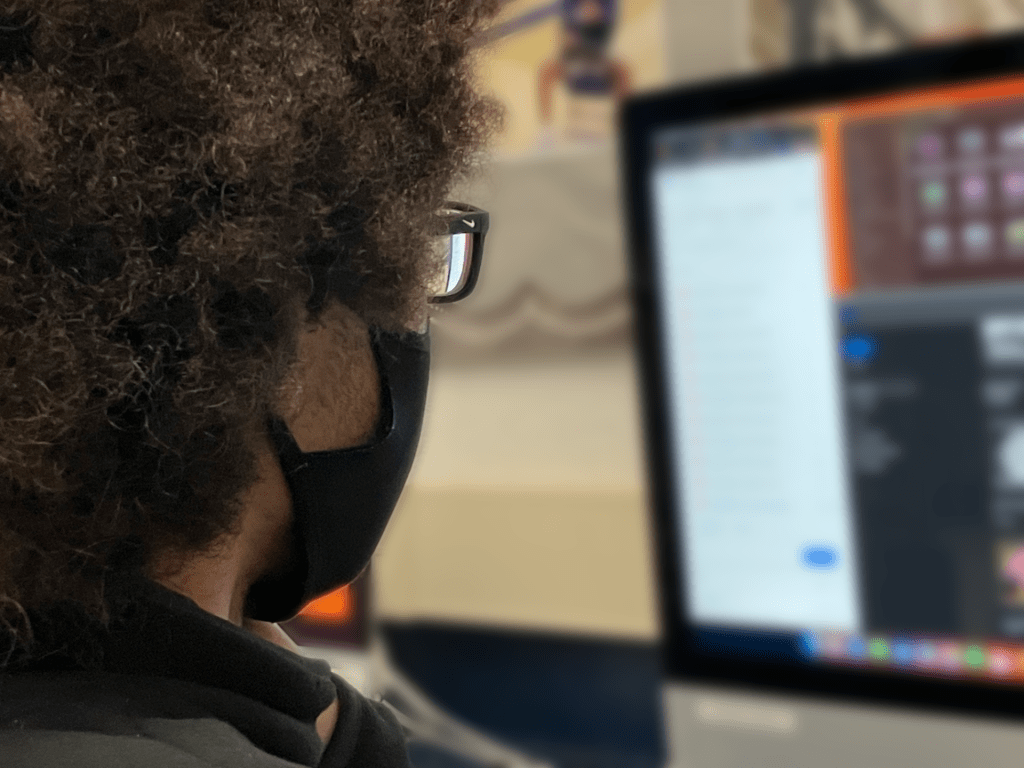
3. Pick one of your photos, what emotions or messages did you intend to convey through this photograph?
A. My small depth of field photo is one that captures the most emotion for me. I think it showcases how we fail to concentrate on the person behind the work. As a result, I blur the work and highlight the person (Dominic Gordon) in the photo.
4.Are there specific elements of art you would like to explore further in your photography?
A. I think I would like to explore the element “texture” further. I like the photo that I took, but want to convey the texture better. What I mean by better is in a way that people can essentially feel the texture through their screens.
5. What concepts or techniques do you want to experiment with in your next project?
A. I want to experiment with more photoshop techniques relating to blur. I have good ideas of photos I want to take, and they can only truly reach their full potential with that blur technique. So in my next project, I’m going to try and take photos that would be enhanced by using that tool and show true meaning.
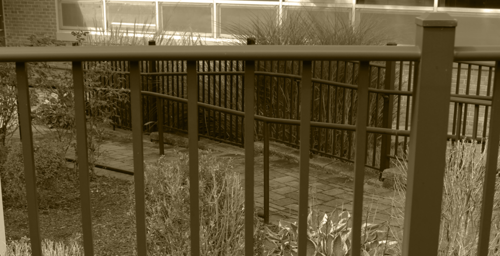
The two Photos I liked best in this series were form and space. I liked the form photo because I thought the sepia effect was cool. I liked the space photo because it was vibrant. One photo in the series that could be better was the geometric shape photo. It looked like just a quick snapshot. It also needed slightly better editing. One composition technique used was leading lines. This is because the space photo led viewers’ eyes to the subject through its vibrant color.
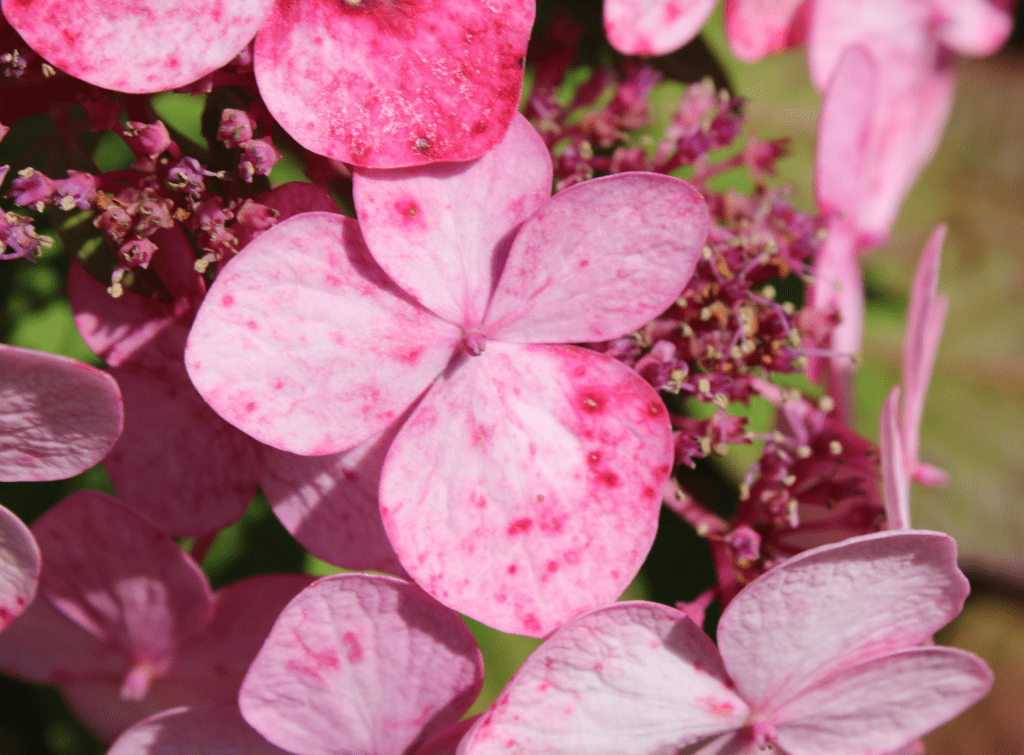
One of his photos I like is his close up flower photo. The colors really show nicely and so do the imperfections. Another photo I like is his form because the overlapping bars make the perspective confusing. One photo that could have been better is that the organic shape photo could have been less blurry. He uses the FILL THE FRAME technique in his space photo.
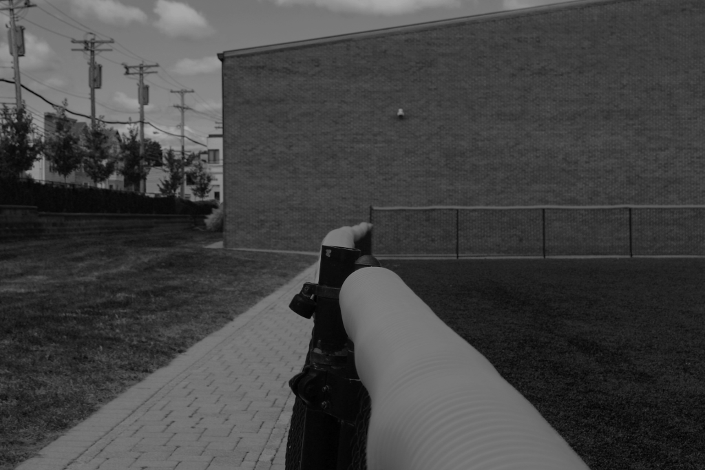
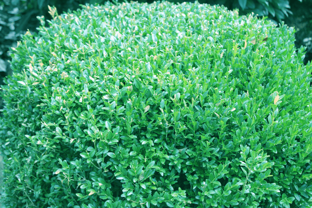
I like his natural line photo because it reminds me of The Walking Dead or some post-apocalyptic thing. Another photo of his I like is texture photo because it looks 3d and looks very warm and fuzzy like its 3d. One thing I don’t like is that he used 2 photos of the same object which is a bit boring and repetitive. His Color photo reminds me of the DIAGONALS where the fence comes in diagonally and comes together in the middle.